
Good files make good labels. These guidelines cover how to set up artwork for flexographic and digital label printing so the label you get matches the one you designed.
Prefer paper? Download these guidelines as a PDF.
You don't have to get all of this right on your own. Upload your artwork at any point and we'll check it and tell you what, if anything, needs fixing. The artwork check is free. Artwork changes are made as part of an order and billed with that order.
Choosing a print process
- Every added color adds cost, so ask us which process fits your design.
- Flexo runs up to 8 colors, usually including a water-based varnish.
- Digital prints CMYK plus orange and violet, with up to two hits of white. Varnish is applied after printing.
- Digital printing holds near-perfect registration. That reduces the concerns about reversed type and trapping described below, which apply mainly to flexo.
- Notes marked "(Flexo)" below apply to flexographic printing only.
General document setup
- Set Illustrator to CMYK color mode, not RGB: File > Document Color Mode > CMYK.
- Set raster effects to 300 ppi: Effect > Document Raster Effects Settings > Color Mode: CMYK, Resolution: High (300 ppi).
- Raster images should be 300 dpi or higher at the size they're used in the label.
- Bitmap images should be 1,200 dpi or higher at the size they're used.
- Name every color in your file clearly.
- Add a 1/16″ bleed to any graphic that runs to the edge of the label. This allows for die-cutting tolerance.
- Keep copy, logos and graphics at least 1/16″ in from the edge of the label where you can. Normal variation in cutting then won't change how the label looks.
- Food-safe inserts are different: insert artwork can't bleed. Keep ink away from the edges.
Setting up a dieline
- Use Illustrator's rulers and guides to place images and layout accurately.
- Build the artwork at the exact size the label will print.
- A typical corner radius is 1/8″. If you're not sure, ask us and we'll confirm it.
- Stocked size? Start from one of the dieline templates.
- Put the dieline on its own layer, with center marks that line up exactly with the center marks on the design. Make the dieline a color that isn't used in the design.
Spot colors
- Digital jobs are mostly printed in CMYK. The exceptions are white, and any color that has to be reproduced as a spot color.
- Spot colors are matched to the Pantone Matching System® (PMS) as closely as the process allows.
- Use a spot color:
- for text, to keep it as legible as possible;
- for elements that need vivid color, since CMYK can only reproduce part of the color range accurately;
- for heavy black text or graphics. Process black is laid down lightly and looks dark gray unless it's separated and printed as a spot color;
- when a color can't be matched in CMYK, such as a corporate or logo color;
- for metallic or fluorescent colors, which use special pigments and can't be built from CMYK.
- If the job uses white ink, name the swatch “White Pass” and name the layer the same way in Illustrator's Layers panel.
- Identify spot colors in the color palette by their Pantone number.
- Mark any special match colors as such in the artwork.
Metallic inks
- Metallic inks look better on gloss material than on matte paper.
- For a metallic look on digital labels, we print on silver or holographic stock.
- Avoid using metallic inks for tints or screens. They tend to fill in and look dirty.
Screens, gradients and vignettes
- It's common to separate a solid, heavy color from the screen plate of the same color. The screened area prints cleaner and the solid keeps its density. Black text is often separated from the CMYK black for this reason. (Flexo)
- Avoid using a screen of a color across a large background. Press movement and vibration can cause uneven color. Use a lighter, solid PMS color instead. (Flexo)
- Don't let a gradient drop below a 1% screen. That prevents a hard edge where the screen ends. (Flexo) Digital printing can go to 0%.
- Avoid stopping a vignette in the middle of an area. A 3% minimum dot on the plate will probably print at 5–7% or more and leave a harsh or dirty edge. Carry the vignette to the edge of the label, or hide the end behind another graphic.
- Avoid gradient blends between two or more spot colors of complementary hues. The mix prints muddy.
CMYK
- Black text may need to be separated from the CMYK plate so the process black prints clean while text and solid black areas stay heavy and dark. (Flexo only)
- Avoid reversing type out of CMYK or other multi-color builds. When you can't avoid it, outline the type with black or another dark color at least 0.75 pt (0.01″) thick so normal registration variance doesn't contaminate it. (Flexo only)
- If a color in a gradient is under 5% after converting to CMYK, preview the design with that color removed. If nothing meaningful changes, take it out. Flexo dot gain shows most in the highlights, and the image will be cleaner without it.
- When building a blue from CMYK, keep at least a 25% difference between cyan and magenta. Too much magenta pushes blue toward purple.
- Don't embed Photoshop files in Illustrator files. Link them, and send the CMYK Photoshop file separately so it can be adjusted for flexo or digital.
Positive type and fonts
- Minimum type size: 4 pt.
- Minimum rule or line weight: 0.25 pt.
- Build text from one solid color for the best result.
- Always create text as vector. Raster text has jagged edges, and small text becomes hard to read.
- For small type (4 to 8 pt), use bold sans-serif fonts. Registration, trademark and copyright marks (®, ™, ©) under 6 pt must be bold.
- Don't apply bold or italic styling to a font. Choose the bold or italic version from the font menu.
- Align columns and text with tabs, not the spacebar.
- If you convert fonts to outlines, remember they can no longer be edited.
- Avoid TrueType fonts.
Reverse type
- Minimum type size: 6 pt.
- Minimum rule or line weight: 0.75 pt.
- The minimum recommended channel or rule separating two color areas is 1.5 pt.
- For white knockout (non-ink) areas, don't use a spot color swatch. Use Illustrator's standard white: C=0, M=0, Y=0, K=0.
- Reversed text and objects work best when one solid color surrounds the reversed area. (Flexo)
- Reversed text is best in a bold font.
- If reversed text or objects sit within process color or several combined screens, or run from one spot color into another, outline them with a black keyline. This hides normal registration movement. (Flexo)
Drop shadows
- Drop shadows aren't a problem in digital printing.
- In flexo they can be hard to print, especially on small type and most of all on small reversed type. On large type or other graphics, check that the shadow stays thicker than the minimum rule width. If it traps with a background color, double that width.
Barcodes
- Print barcodes in black, or in another color that contains no red, orange or purple.
- Build barcodes from a single printed color. With more than one color, registration movement can make the code unscannable.
- Use a white background. Any other color lowers the contrast and can make the code unscannable.
- Leave quiet zones (no print) of 1/8″ to the left and right of the barcode so it scans properly.
- For flexo, set barcodes so the bars run in the direction the label travels through the press, not in the ladder position. This avoids distortion.
- If you need a barcode generated, we can do that for you.
Saving and sending files
- Always save a working copy and a final copy of your artwork.
- Send files through the artwork upload page, or email them to robin@tempac.net.
- Use masking tools. Covering unwanted graphics with white-filled objects causes problems in prepress. Remove hidden elements such as templates and old artwork.
- Delete unused colors from the color palette and indicate any special match colors.
- Include all the fonts your label uses. This isn't needed if you've outlined the text, but outlined text can't be edited if you ask for a change later.
- If you can, include a list of the fonts used. Missing fonts are the leading cause of delays in processing artwork.
- Supply every linked, placed or embedded image as a separate file in its native format, in a folder named “links”. Prepress needs them.
- If you can, tell us the file name, the program and the version the artwork was created in.
- Don't trap the artwork. Prepress handles trapping.
- Compress files into a ZIP before sending. This keeps them from being corrupted in transfer.
- Include a PDF so we can check that the file we received is correct and that fonts and effects came through.
Quick reference
The minimum type sizes, rule sizes and die tolerance apply to both digital and flexo.
| Specification | Flexo | Digital |
|---|---|---|
| Minimum type size, positive | 4 pt | 4 pt |
| Minimum type size, reverse | 6 pt | 6 pt |
| Minimum rule, positive | 0.25 pt | 0.25 pt |
| Minimum rule, negative | 0.75 pt | 0.75 pt |
| Typical die register tolerance | 1/16″ | 1/16″ |
| Minimum highlight dot | 1% | 0% |
| Vignette (gradation) range | 1%–100% | 0%–100% |
| Typical line screen | 150 lpi (varies 85–175 lpi) | n/a |
| Trap size | 0.007″–0.02″ | 0″ |
Reference charts
Three charts to help you describe a label: which way it comes off the roll, how round the corners are, and which dimension goes first. You can also open the corner radius and label dimension charts on one printable page or download them as a PDF.
Label unwind chart
Label unwind chart: copy positions 1 to 8 (PDF)
Corner radius chart
How to figure label dimensions
“X” (web width) x “Y” (repeat length)
For example, a label that is 4″ across the web and repeats 6″ along the web is called a 4″ x 6″.
Reversing these dimensions will tell the printer that you want the label to be the opposite orientation on the web.
Dieline templates
Start from one of these if your label is a stocked size. Each template has the dieline with a 1/8″ corner radius on its own layer, a 1/16″ bleed guide and a 1/16″ safe zone guide.
| Label size (across × along the web) | PDF, with layers and spot colors | SVG |
|---|---|---|
| 4″ × 2″ | 4 × 2 dieline (PDF) | 4 × 2 dieline (SVG) |
| 4″ × 3″ | 4 × 3 dieline (PDF) | 4 × 3 dieline (SVG) |
| 4″ × 4″ | 4 × 4 dieline (PDF) | 4 × 4 dieline (SVG) |
| 4″ × 6″ | 4 × 6 dieline (PDF) | 4 × 6 dieline (SVG) |
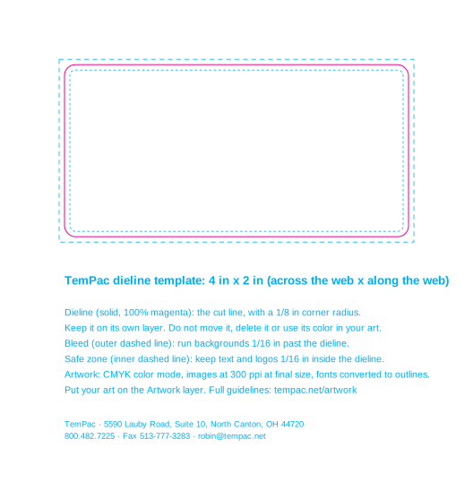
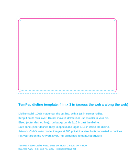
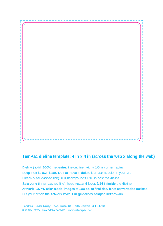
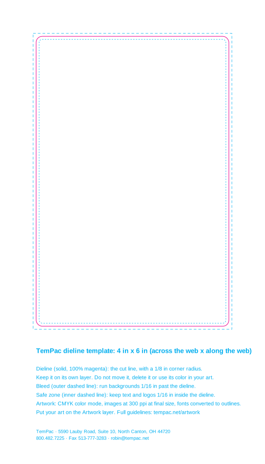
- In the PDF, the dieline is a spot color named "Dieline" and the guides are a spot color named "Guides", so neither lands on your CMYK plates. Open it in Illustrator and put your art on the Artwork layer.
- SVG has no spot colors. There the dieline is 100% magenta and the guides are 100% cyan, each on a named layer.
- Need a different size or shape? Tell us the dimensions and we'll send a dieline.
Additional resources
- GS1 US: how to get a UPC barcode. New barcode and UPC numbers come from GS1 US (formerly the Uniform Code Council).
- GS1 General Specifications. The barcode standard itself.
- FDA Food Labeling Guide. Net weight, Nutrition Facts and more for FDA-regulated foods.
- FDA: Nutrition, Food Labeling, and Critical Foods.